Design
One of my favorite parts of journalism has to be the design aspect. From working on News pages during my sophomore year to now overseeing and designing all 16 pages of our publication, creating page layouts has been a process I genuinely enjoy. Whether it’s experimenting with new layouts, incorporating bold visuals or creating a total of 10 unique covers since becoming an editor, I take pride in using design to elevate each story. To me, design isn’t just about aesthetics—it’s about bringing a story to life for our readers.
Covers

Cover
February 2025
I initially struggled with how to visually represent public transit in Detroit due to its limited accessibility and safety concerns. Capturing buses in motion was difficult, and my original photo choice didn’t convey the story effectively. I pivoted when I saw how compelling the view inside the People Mover was—it offered a clear visual of how limited the system is, serving only downtown areas. This challenge pushed me to think outside the box and experiment with different types of photos to tell a stronger, more honest story.
Cover
January 2025
As I brainstormed ideas to visually represent our 'brain rot' news story, I wanted to emphasize the scientific aspect of the term, which led me to collaborate with my mom. Initially, I searched for a model brain to use for the cover but couldn’t find one that matched my vision. To problem-solve, I designed a brain illustration using Procreate. However, I struggled to make the brain look convincingly 'rotten,' so I incorporated flies to draw attention to the brain and add more visual interest. This creative process challenged me to think critically and adapt my approach to achieve a compelling and cohesive design.

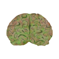

Before Photoshop

Cover
December 2024
Struggling to finalize the cover photo under a time crunch, I initially planned to use an illustration. However, after some reassurance and inspiration from my adviser, I decided to take a more dynamic approach. I gathered representatives from the clubs featured in our story and had them hold up letters spelling out 'CHANGE,' reflecting the shared motive of each club. While it was challenging to coordinate and connect with everyone involved, with the help of a Section Editor, I was able to capture a photo that I’m truly proud of. This experience taught me the importance of collaboration and adaptability under pressure.

.png)
Cover
February 2024
Driving down Jefferson on that cold January morning to find the sky filled with fog was initially frightening to me considering I needed to capture the crisp Detroit skyline. Despite the horrible weather, I took it as an opportunity to make the fog a part of the message. While capturing the shot I could be seen practically laying on the Detroit sidewalks in order to get the perfect angle. After taking the photos I was very scared with how they turned out since the lighting was difficult to grapple with. Throughout the creation of this cover, I went through multiple versions, initially having a wooden hand looming over the city until I eventually decided on the ominous clouds to be the focal point of the photography. Although my confidence for this cover lacked during the process, I am super proud of how it turned out and how it portrayed the story’s message.
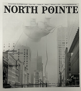

Page Mock-up
First Attempt
Cover
December 2023
When I first became North Pointe's Managing Editor, I created numerous variations of art, including illustrations, comics, and infographics. However, one form of art I shied away from was photography. When I initially approached creating my third cover ever, I wanted to create a cover illustrating the Israel and Palestine conflict. However, I quickly realized that this approach would not be suitable for our story. After stressing over how we could create a cover connecting to one of our other stories, my adviser gave my Editor-in-Chief and me some great feedback on creating a captivating cover. Although this cover was pretty last-minute, I ended up taking the photo at 4 a.m. Even after taking this photo, we still ran into issues regarding the symbolism of the photo. After discussing with my executive board, we formulated a clear message for the cover.

Page Design
Life Page
March 2025
This was by far the most tedious and complex page design I’ve ever created. As both the writer and designer for the story, I knew we needed a visually compelling way to showcase the library’s unique features—which inspired the idea of a wheel layout. Creating the wheel was incredibly time-consuming, as I had to build each piece manually using anchor points. Despite the challenge, I’m extremely proud of the final result. This page pushed me out of my comfort zone and allowed me to experiment creatively in a way I hadn’t before.


Feature Pages
February 2025
One of my favorite spreads I have ever designed was my feature on public transit in major cities. As both the writer and designer, I had a clear vision from the start. I knew annotated maps would make the page both engaging and informative, and I took a creative risk with our quote collection by formatting the question vertically—something we had never done before. This spread gave me the freedom to experiment with new layouts while also setting an example for other editors on how to bring a vision to life and push the boundaries of design.

Life Page
January 2025
From the moment I decided to take on this story, I already had a clear vision for the page design. Inspired by teaching the staff about Alternative Story Forms, I knew I wanted to experiment with an annotated photo, a format we hadn’t explored much before. My goal was to highlight the different aspects of the field trip and their significance, so I divided the page into sections: watercolor paintings, dishware, the Arab American National Museum, and the interactive feature at the Detroit Institute of Arts. Each section included descriptions and quotes from the World History teacher, who explained how each part of the field trip connected to the curriculum. While I had to adjust the layout and photos extensively to ensure there was enough space for the annotations, I’m proud of the result. The page is visually engaging and provides a dynamic way for our readership to connect with the story.
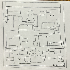

Page Mock-up

Reviews Page
December 2024
Hoping to revitalize the Reviews section and cover a variety of stores, I wanted the page design to stand out and feel unique. After brainstorming with my mentee, we decided that a color-coded map would be the best way to review Detroit's holiday markets. Designing this page was especially enjoyable because it allowed me to showcase my creativity and experiment with a concept I hadn’t seen done before. The result was both visually engaging and informative, offering readers a fresh perspective on the Reviews section.
Reviews Page
November 2024
Midway through Production Night, the Reviews section editor approached me with a crisis: her pages had completely disappeared. After searching through our various folders and confirming the files were gone, we didn’t let the setback derail us. To resolve the issue, I decided we should split the workload—she would design one page, and I would take on the other. Initially unsure how to approach my page, I reviewed the story and noticed the abundance of photos the writers had taken. Inspired, I decided to showcase each item they purchased across the page, creating a visually engaging layout. In the end, I’m incredibly proud of how we turned a challenging situation into an opportunity to collaborate and produce a polished, appealing final product.


Reviews Page
january 2024
Over the course of the year, it is inevitable that some editors might not be able to attend production nights, which was the case for our January Issue when individuals were out of town over winter break. Since our Reviews Section Editor was out, I decided to take over her pages and create a unique layout we had not done before. Designing this page was a super fun process because prior to being on the executive board, I was the News Section Editor, which did not allow for a ton of freedom or experimentation with page design. While creating this page we were able to develop a new signature style with overlapping photos and shapes with white borders, which can be seen across our reviews section. While experimenting with reviews page design was not planned, I am so happy that I was able to step outside of my comfort zone and try designing for a section I had never done before.
.png)
News Page
January 2024
One of my favorite page designs from my time as a section editor is the Issue 2, Page 2 news layout, which highlights a template I created. A standout feature of this page is the infographic, where I used a shade of green that was carried through the headline and pull quote, tying the design together and creating a cohesive look. This design was particularly meaningful to me because it was only my third time using InDesign, yet I was able to push myself to learn new skills, including how to create templates. Overall, I’m proud of how this page turned out, as it reflects both my growth and creativity.


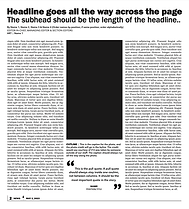
My Template

News Page
October 2022
The first time I used InDesign, I was completely overwhelmed by its intricate and tedious features. I struggled with saving photos properly and lacked an eye for design. Looking back, I know I could have approached the page very differently with the knowledge and stylistic vision I have now. However, this piece serves as a reminder of how far I have come since first becoming a page editor my sophomore year. Mastering InDesign has been a long process, and each page I design now reflects the growth and confidence I have gained along the way.
Redesigning Page Templates


Templates
Summer 2024
With every editor stepping into a new role this year—many as section editors for the first time—I saw the need for a fresh approach to our page templates. The old designs had limitations, leaving little room for creativity and freedom. To give our editors a clean slate, I redesigned the templates, allowing them to build layouts that best fit their sections. I structured them with open boxes where they could sketch their ideas, ensuring they had the flexibility to shape their pages while still maintaining strong design principles. This gave our staff ownership over their work and set them up for success.


Creating the Profiles section


Profiles Page
Evolution 2023 - 2025
Over the summer before my junior year, I knew I wanted to transform the back cover into a new section of our newspaper. After thinking about what North Pointe stands for I decided that highlighting students, staff and groups at North allowed for us to showcase our diverse environment; which is when I came up with the idea of the Profiles section. Since our new section did not have an editor, I decided to take on the role of designing the page each issue which allowed me to experiment more with In Design. While working on this page, I noticed that all three profiles were struggle to fit on the page at times, so the summer before my senior year I decided to cut it down to just one profile that also features a Q & A.